


Evolving a respected brand without losing its legacy is no small task especially in the traditionally conservative engineering sector. Our goal was to modernise the KTH identity while preserving the trust and recognition it already held. That meant unifying the three companies under one cohesive visual umbrella, refining existing assets like colours and logos, and presenting them in a fresh, forward looking way.


.jpg)
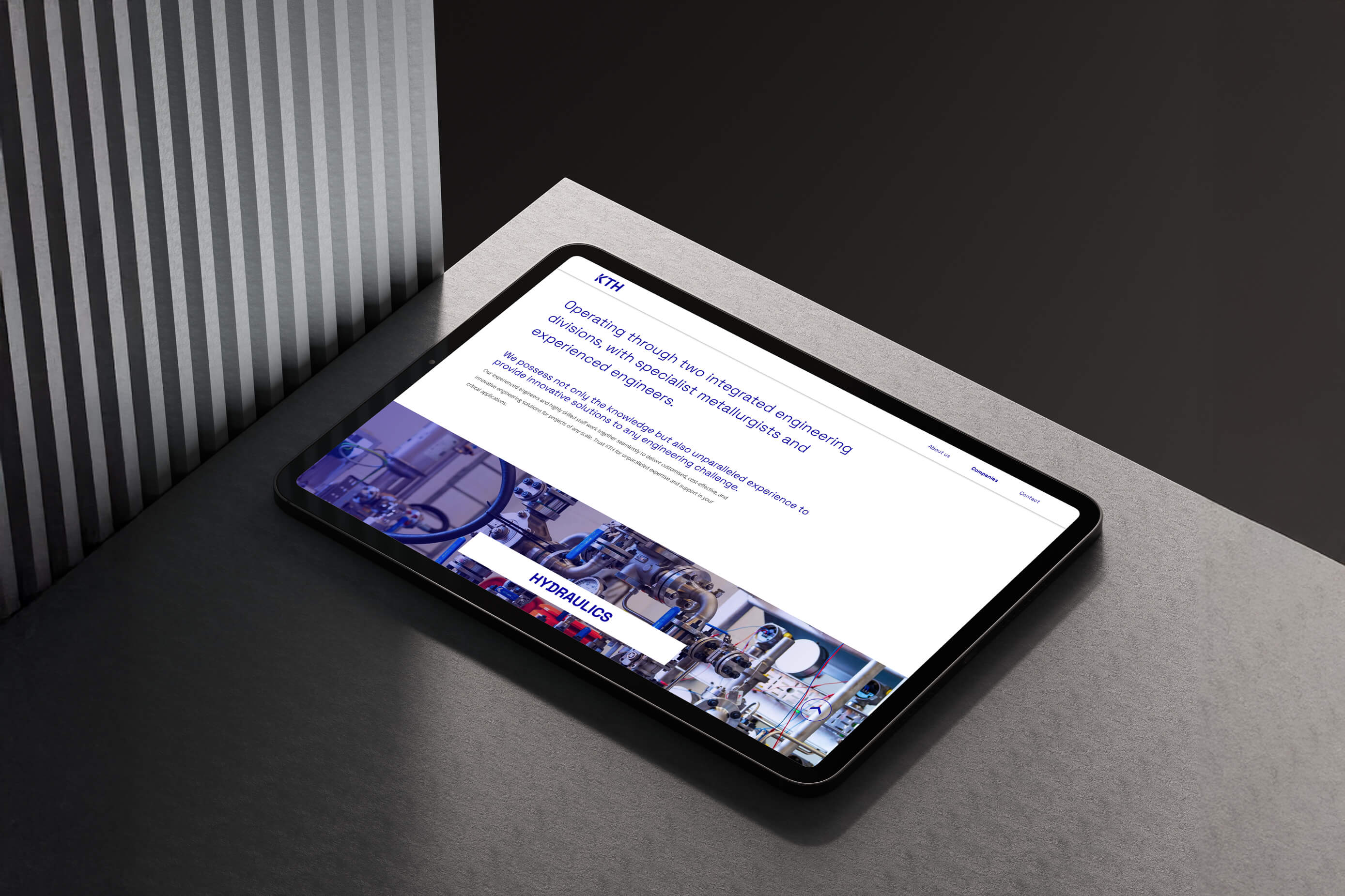
We kept it simple, smart, and strategic. By evolving the core brand elements, not replacing them we ensured the new identity felt both familiar and fresh. Translating the brand from print to digital was a key focus, making sure every touchpoint, from marketing materials to the new website, spoke the same language. With bespoke iconography, modern typefaces, and flexible visual devices, the KTH brand is now built to stand out and scale in a competitive marketplace.

.jpg)
Aside from one very happy client, KTH now stands proudly apart from the crowd with a revitalised brand that brings clarity, confidence, and cohesion across all three companies. From photography to digital experience, the new identity reflects the dynamism of a modern engineering firm, while staying true to its roots as a trusted, family run business.


